Tutorial
agate-charts is an extension for the agate data analysis library that adds support for quickly exploring data using charts. It does not create polished or publication-ready graphics. If you haven’t used agate before, please read the agate tutorial before reading this.
In this tutorial we will use agate-charts to explore a time-series dataset from the EPA documenting US greenhouse gas emissions for the month of June 2015.
Setup
Let’s start by creating a clean workspace:
mkdir agate_charts_tutorial
cd agate_charts_tutorial
Now let’s download the data:
curl -L -O https://raw.githubusercontent.com/wireservice/agate-charts/master/examples/epa-emissions-20150910.csv
And install agate-charts:
pip install agate-charts
You will now have a file named epa-emissions-20150910.csv in your agate_charts_tutorial directory.
Note
agate-charts plays nicely with ipython, Jupyter notebooks and derivative projects like Atom’s hydrogen plugin. If you prefer to go through this tutorial in any of those environments all the examples will work the same. You may need to add %matplotlib inline to the top of your scripts as you would in an ipython notebook.
Import dependencies
Our only dependencies for this tutorial will be agate and agate-charts. Importing agatecharts attaches the agatecharts.table methods to Table and the agatecharts.tableset methods to TableSet.
import agate
import agatecharts
Load data
Now let’s load the dataset into an Table. We’ll use an TypeTester so that we don’t have to specify every column, but we’ll force the :code:` Date` column to be a date since it is in a known format.
tester = agate.TypeTester(force={
    ' Date': agate.Date('%Y-%m-%d')
})

emissions = agate.Table.from_csv('examples/epa-emissions-20150910.csv', tester)
Now let’s compute a few derived columns in order to make our charting easier. The first column will be the numerical day of the month. The latter three correct for an issue where the EPA has included empty columns instead of numerical zeroes.
emissions = emissions.compute([
    ('day', agate.Formula(agate.Number(), lambda r: r[' Date'].day)),
    ('so2', agate.Formula(agate.Number(), lambda r: r[' SO2 (tons)'] or 0)),
    ('nox', agate.Formula(agate.Number(), lambda r: r[' NOx (tons)'] or 0)),
    ('co2', agate.Formula(agate.Number(), lambda r: r[' CO2 (short tons)'] or 0))
])
Of course, for analysis purposes you should always be extremely cautious in assuming that blank fields are equivalent to zero. For the purposes of this tutorial, we will assume this is a valid transformation.
Your first chart
The emissions dataset includes data for several states. We’ll look at the states individually later on, but to start out let’s aggregate some totals:
days = emissions.group_by('day', key_type=agate.Number())
day_totals = days.aggregate([
    ('so2', agate.Sum('so2')),
    ('co2', agate.Sum('co2')),
    ('nox', agate.Sum('nox'))
])
The day_totals table now contains total counts of each type of emission. Note that we don’t know if this data is comprehensive so we shouldn’t assume these are national totals. (In fact, I know that they aren’t for reasons that will become obvious shortly.)
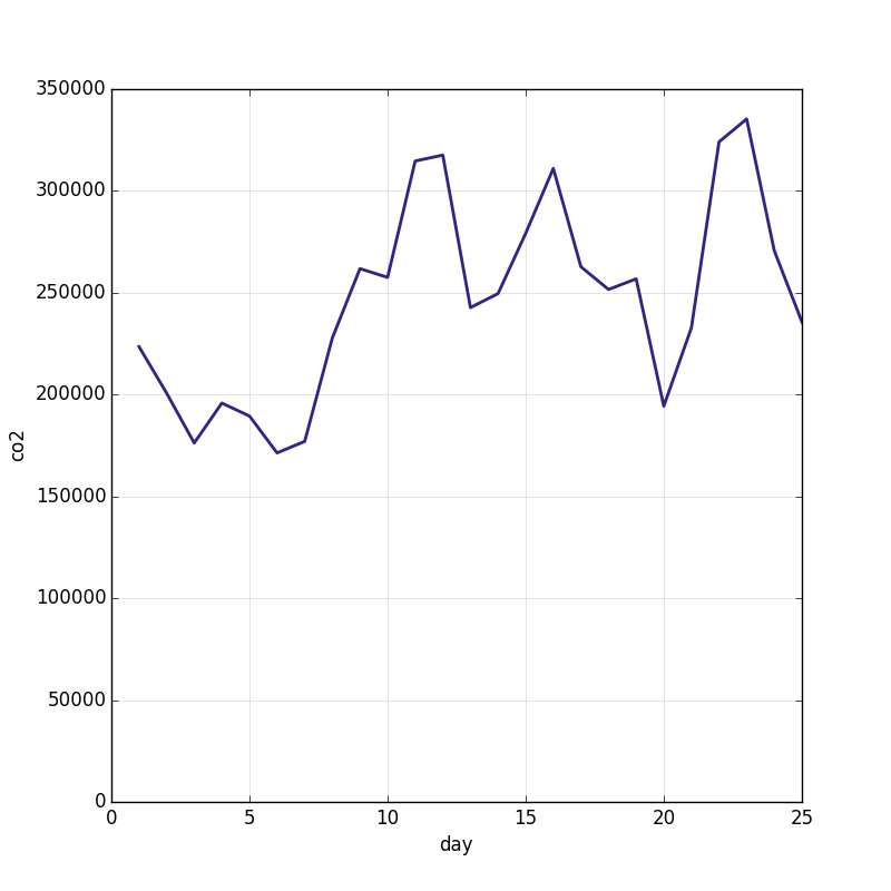
Now let’s render a line chart of the total co2:
day_totals.line_chart('day', 'co2')
Notice that line_chart is a method on the Table. Remember that importing agatecharts added the agatecharts.table methods such as agatecharts.table.line_chart() to Table and the agatecharts.tableset methods to TableSet.
If all goes well, you should see a window popup containing this image:
You can also choose to render the image directly to disk, by passing the filename argument:
day_totals.line_chart('day', 'co2', filename='totals.png')
Warning
agate-charts uses matplotlib to render charts. Matplotlib is a notoriously complicated and finicky piece of software. agate-charts attempts to abstract away all the messiest bits, but you may still have issues with charts not rendering on your particular platform. If the script hangs, or you don’t see any output, try specifying a rendering backend before importing agate-charts. This shouldn’t be an issue if you’re rendering to files.
Render multiple series
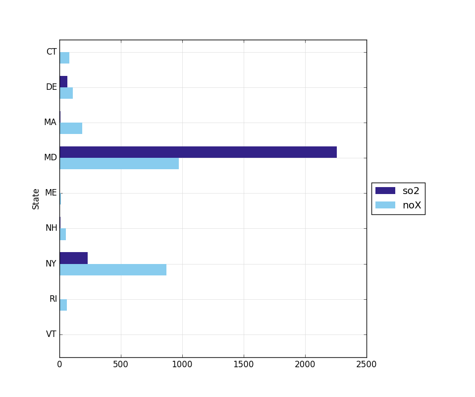
You may also want to render charts that compare to series of data. For instance, in this dataset the sulfur dioxide (so2) and nitrogen oxide (nox) amounts are on similar scales. Let’s roll the data up by state and compare them with a bar chart:
states = emissions.group_by('State')
state_totals = states.aggregate([
    ('so2', agate.Sum('so2')),
    ('co2', agate.Sum('co2')),
    ('noX', agate.Sum('noX'))
])

state_totals.bar_chart('State', ['so2', 'noX'])
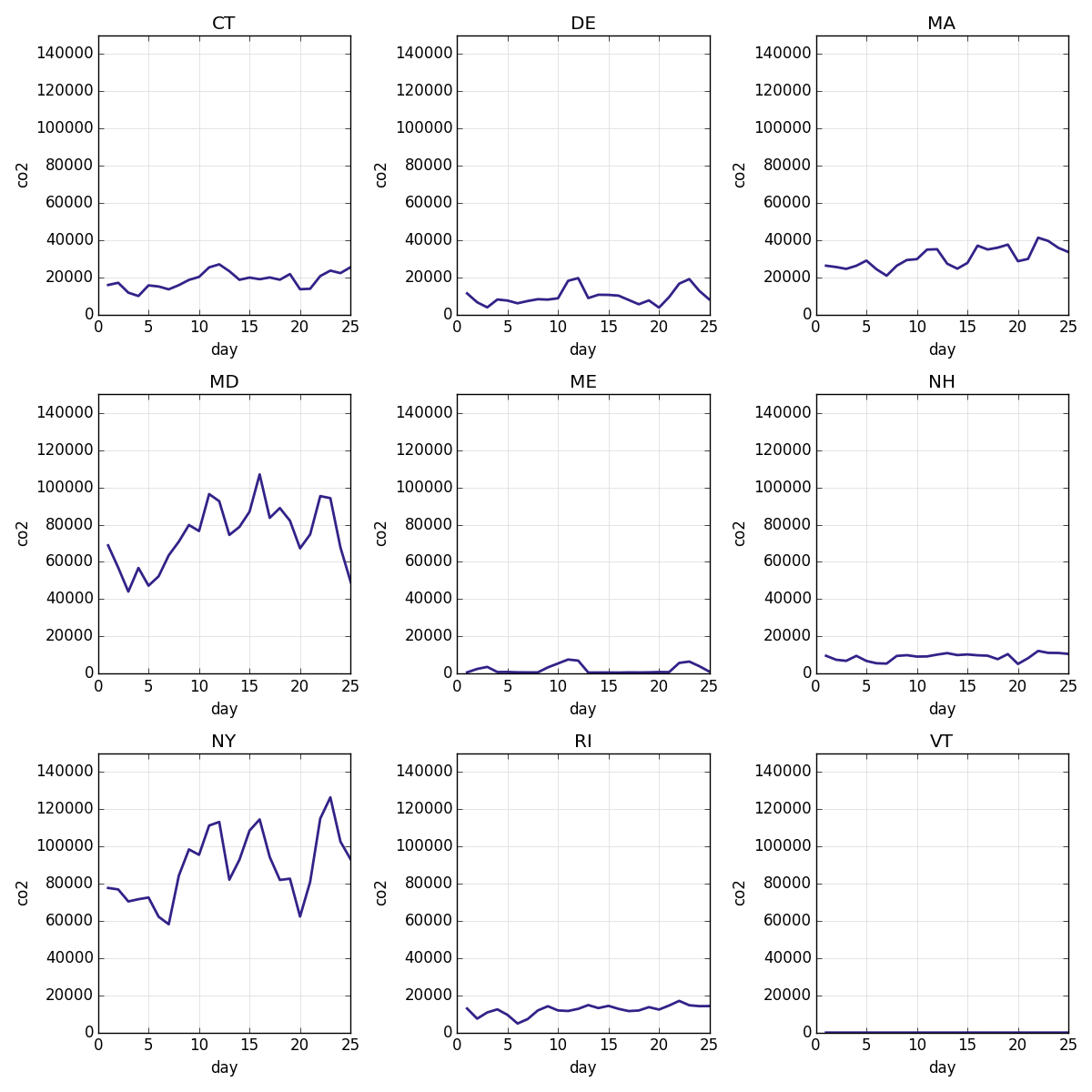
Small multiples
agate-charts most powerful feature comes when these same methods are applied to instances of agate’s TableSet. In this case, agate-charts will automatically create small multiples of the chart for each table in the set. For example, here is a let’s create a line chart of the co2 output for each state:
states.line_chart('day', 'co2')
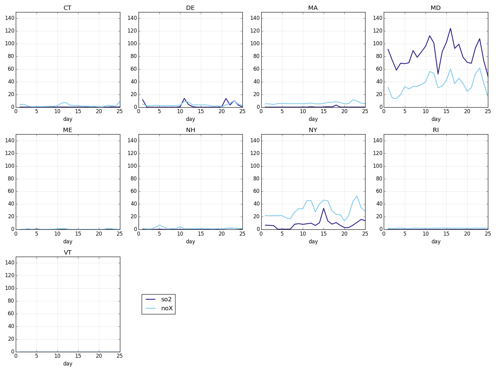
Of course, you can also combine small multiples and multiple time series:
states.line_chart('day', ['so2', 'noX'])
Where to go next
agate-charts is designed for making quick exploratory charts that you don’t put a lot of thought into. From here you might take your data into Illustrator, D3 or some other tool for creating a polished presentation.
If you enjoy using agate-charts you should also check out proof, a library for building data processing pipelines that are repeatable and self-documenting. If you’re rendering many charts it can save you tons of time by skipping ones you’ve already done.